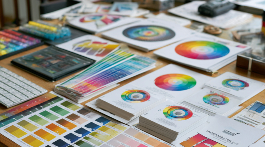
Unleashing the Power of Color: Transform Your Brand’s Impact
At ARC, we understand the crucial role that color plays in shaping the emotional response and brand recognition. Through effective print design color theory, our team knows how to craft a palette that resonates with your audience and reinforces your brand’s message. Recognizing color’s pivotal influence in marketing materials, we delve into the science behind your choices, aiming to drive a powerful emotional response from your audience.
Explore how effective print design color theory drives emotional response and brand recognition
We take pride in our expertise in color theory, ensuring that every hue and shade we select serves a purpose. By understanding the associations and emotions tied to each color, we help brands tap into the psychology of their target audience. This knowledge is what allows us to create designs that are not only aesthetically pleasing but also emotionally compelling, bolstering brand recognition in the process.
Understand the science behind color choices in print design for maximum effect
The science of color is a foundation of our service offerings. We consider how each color interacts on paper, how they mix, and the impact they have on the viewer. Our strategic choices draw upon scientific principles to enhance the readability and attractiveness of your printed materials. This kind of precision elevates the effectiveness of your brand communication.
Discover how psychological triggers linked to color enhance marketing materials
Our approach goes beyond the surface, as we recognize the psychological triggers associated with color. Utilizing these subtle yet powerful cues, we refine the emotional tone of your print materials. This approach ensures that every piece we produce not only presents your content effectively but also aligns with the psychological landscape of your customer base and amplifies the desired reaction to your messaging.
Harnessing the Spectrum: Strategic Color Selection in Print Design
Our commitment at ARC is to selecting colors that not only define your brand but also engage your audience through strategic placement and harmonious coordination. We pay meticulous attention to color harmony and color contrast, setting up your print designs to be visually striking and easy to comprehend at a glance. It’s about creating an equilibrium between aesthetics and functionality, through which your brand’s presence is both noticed and remembered.
Learn about the role of color harmony in creating visually appealing designs
Color harmony is a key player in our design strategy, compelling us to create compositions that are coherent and soothing to the eye. We understand that harmony is essential for crafting designs that are perceived as unified and professional. Hence, we focus on combinations that enhance the overall appeal, while facilitating a seamless reflection of your brand’s identity.
Dive into the significance of color contrast for readability and attention – grabbing
Effective print design color theory also calls on the judicious use of contrast to guarantee that your message stands out. High contrast in the right areas ensures that your content is legible and that key elements capture the reader’s attention. By optimizing contrast, we enhance the user experience of your printed materials, leading to more memorable interactions with your brand.
Recognize color trends and cultural associations that can influence audience perception
Finally, we stay ahead by keeping an eye on emerging color trends and understanding the cultural contexts in which our designs will be received. Our global perspective enables us to factor in how shifts in color preferences and cultural connotations might affect audience perception of your brand. With this awareness, we ensure your print designs stay relevant and resonate deeply with current and potential customers.
Color Matters: Making Informed Decisions with Document Imaging
Acknowledging the importance of precision in document imaging is central to our philosophy at ARC. We are experts in color management, ensuring that the integrity of your colors is maintained from the digital screen to the final printed product. Our processes and services are designed to give you peace of mind, knowing that what you envision is what will be delivered.
Realize the importance of high – quality reproduction in maintaining color integrity
The quality of color reproduction can make or break a printed piece. We prioritize this aspect by using state – of – the – art document imaging technology to preserve the original vitality of your colors. Our commitment to high – quality reproduction is a testament to our desire to maintain unwavering color integrity with every project we undertake.
Address the technical aspects of color management in print services
Our technical know – how in color management sets us apart. We demystify the complexity behind print services to ensure a seamless transition from design to print. At every stage, from calibration to the final press check, our technicians apply their rigorous expertise to manage colors effectively, so that every hue is just as you envisioned.
The role of professional document imaging and graphic production services in preserving color accuracy
Precision is non – negotiable when it comes to color accuracy. Our professional document imaging and graphic production services are at the forefront of this precision, utilizing the best practices to guarantee that the final printed materials are true to your brand’s colors. With ARC, you can rest assured that your visual content will be a flawless ambassador for your brand.
Color Theory Fundamentals in Print Design
At ARC, we understand that effective print design color theory is not just about aesthetics but a critical component in conveying your brand’s message. The fundamental principles of color theory guide us in selecting a color scheme that is not only visually pleasing but also functionally effective. Our expertise in color models, specifically CMYK (Cyan, Magenta, Yellow, and Key), is crucial because these colors serve as the printing industry’s building blocks for creating a vast spectrum of hues in print material. We also prioritize the application of the color wheel in our design process, as it helps in crafting a compelling and coherent color palette that aligns with your brand’s identity.
Maximizing Brand Impact with Color Psychology
Through the strategic use of color psychology, we maximize brand impact by utilizing hues that evoke the desired emotional response and strengthen brand positioning. By analyzing different colors and their associated emotions, ARC crafts marketing materials that resonate with the target audience. We have seen the power of color psychology in successful brand case studies and integrate this knowledge to align your color choices with your brand’s messaging and core values. This deliberate approach ensures that every design we produce not only stands out visually but also reinforces the brand narrative you aim to convey.
Technology and Techniques for Precision in Print
To guarantee precision in print, we leverage cutting – edge technologies and methodologies for impeccable color matching. Our color calibration tools and advanced printing techniques are instrumental in achieving color consistency across all print materials. At ARC, we emphasize the significance of meticulous color quality control throughout the printing process. With our team’s deep expertise and dedication to excellence, we ensure each project reflects the intended color profile with ultimate accuracy, setting the stage for impactful and effective print design color theory execution.
- Selection of optimal color schemes for brand coherence and audience engagement
- Use of professional – grade color calibration tools for color fidelity
- Expertise in CMYK color model application for full – color print production
- Integration of color psychology principles to enhance brand messaging
- Continual monitoring of color quality control for maintained consistency
Implementing Color Theory: Elevate Your Brand’s Visual Storytelling
In the sphere of brand development, harnessing the power of effective print design color theory is integral to weaving compelling visual stories. Our understanding of color nuances not only refines the aesthetic appeal of marketing materials but also deepens the narrative your brand seeks to tell. At ARC, we see color as a cornerstone of visual communication – a tool that, when employed with expertise, enhances your message and captivates your audience.
Understanding the Narrative Power of Color in Branding
Our team at ARC acknowledges the transformative impact that effective print design color theory can have on a brand’s story. Colors are not just fillers on a palette but characters that play critical roles in your brand’s plot. They can set the scene, drive the mood, and influence the emotional connection your audience forms with your brand. By mastering color theory, we ensure that every hue supports the overarching narrative, creating a cohesiveness that resonates and stays with your audience.
The Power of Color in Visual Communication and Marketing
Color is the silent yet potent language that communicates your brand’s ethos before a single word is read. Our mission is to amplify this language, to elevate your marketing solutions and weave color in ways that not only attract but also retain interest. The strategic application of color theory is pivotal in distinguishing your marketing materials from the sea of content vying for attention. It is the difference between being seen and being remembered.
Why a Color Strategy is Key to Effective Visual Content
We firmly believe that a deliberate color strategy is essential for impactful visual content creation. It’s about making informed choices that align with your brand identity and values. By working with ARC, you’re not just accessing printing services; you’re tapping into a reservoir of knowledge in effective print design color theory. Let us guide you in selecting color combinations that will illuminate your brand’s strengths and enthrall your audience. It’s time to recognize the formidable role of color in the visual symphony of your brand’s story.
FAQ
How can color theory improve my brand’s recognition?
By applying color theory principles, we help ensure that your brand uses colors that not only stand out but also resonate with your target audience, fostering brand recognition. Additionally, using a consistent color palette across all your marketing materials can significantly enhance your brand’s memorability.
What’s the difference between CMYK and RGB color models?
CMYK and RGB are two color models used in the design world. CMYK, standing for Cyan, Magenta, Yellow, and Key (Black), is the standard for print materials, while the RGB model, representing Red, Green, and Blue, is used for digital displays. We evaluate the specific needs of your project to ensure we use the appropriate color model for optimal results.
Can you customize color palettes to match my existing brand colors?
Absolutely. We specialize in color matching and can customize palettes to align with your existing brand colors, providing a seamless visual experience across all your materials. Furthermore, we utilize advanced color calibration tools to ensure consistency in reproduction.
What role does color psychology play in print design?
Color psychology is critical in print design as it influences how your audience perceives your brand and its messaging. We leverage this by choosing colors that align with your brand values and evoke the desired emotional response, ultimately helping to convey your messages powerfully and effectively.
How can color contrast enhance the readability of my print materials?
Color contrast can significantly enhance readability by making text stand out against its background. We expertly balance color contrast to ensure that your print materials are not only attention – grabbing but also easily readable, facilitating clear and effective communication with your audience.
How does document imaging contribute to color accuracy?
Document imaging plays a vital role in color accuracy as it involves capturing the true colors of your original materials. Our professional document imaging services are designed to reproduce colors faithfully, ensuring that the colors in your final printed materials are vivid and true to your design.
What printing techniques do you use to ensure color consistency?
We utilize state – of – the – art printing techniques, including color calibration and proofing processes that guarantee color consistency across different prints. Moreover, our team’s expertise ensures meticulous color quality control throughout the printing process.
Are color trends important in print design?
Color trends are quite important as they reflect current consumer preferences and can make your marketing materials feel more relevant and engaging. However, we always recommend balancing trends with your brand’s unique identity to ensure your print design remains timeless and true to your company’s story.
How do cultural associations with color affect my print materials?
Cultural associations with color can greatly impact how your print materials are received by different audiences. We take into account these cultural nuances to make sure your color choices resonate positively with your intended market, avoiding any potential misunderstandings.
Can you help with the entire visual content creation process?
Yes, we can certainly help with the entire visual content creation process. From the initial concept design to the final print production, our team is equipped to assist you with strategic color use and high – quality imaging that align with your brand messaging and values.