Brand Personality Through Signage
Personality. Too often brands undervalue the power that a strong brand personality can have on customers. Brand personality isn’t some intangible abstraction, but the characteristics that your customers see and, ideally, identify with. It’s what makes your company more than a bland facade. It’s what makes it memorable.
The opportunities to produce brand personality are all around you. In-store signage is a perfect example. Signs as practical wayfinding and information markers exist in every retail environment, but their potential is vastly underutilized. If signs are used in your store for functional purposes, then you should jump at the opportunity to optimize their value.
New York-based retail consultant Bob Phibbs, known as The Retail Doctor®, encourages clients to think of signage as a vehicle for bringing authenticity and uniqueness to the store environment. “Signs can be so much more than directions, policies, and the like,” he advises. “I saw a great one over the holidays at a store in Las Vegas: ‘Santa – Leave presents, take brother.’ Do you know how many young guys I saw taking pictures of each other in front of that sign? Lots. Point is, have a personality and let it extend into your signage so customers can have a laugh and become intrigued or entertained.”
By creating these points of experience, goodwill is formed between your brand and a customer. Expressing that personality in interactive and engaging ways fosters a sense that your company is personable, approachable, and, in turn, memorable. Of course, signage should function first and whenever possible entertain second.
So how do you facilitate signage that’s personable, yet still practical?
Inkling Creative Group creative director Jaime Smith, suggests designing for the space. “Stores that blur the line between graphics and interior design are the best,” she says. “Use wayfinding signage that is legible but seamlessly integrated. More and more retailers are integrating signage into the environment, rather than adding it on as a separate layer.”
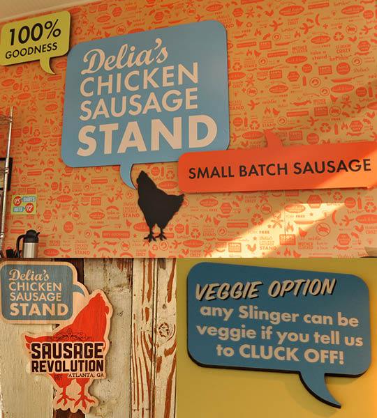
A great example of this concept is the visual environment designed and installed by Riot Creative Imaging in Atlanta for Delia’s Chicken Sausage Stand.
The project included everything from large exterior signs to dimensional graphics, wallpaper, and Color Wave prints for the menu boards — all designed in a homespun, handcrafted style reflective of the restaurant’s artisanal, small-batch sausages. Even the napkin dispensers on picnic tables outside were emblazoned with signs chock full of personality, informing customers about Delia’s catering services and featured flavors.


